
Digital Experience
Website Accessibility for UK Businesses: What Should You Actually Check?
Accessibility is not a score or an overlay. It is the practical ability to perceive, understand and operate the experience across content, design and code.
Velra Studio · · 6 min read
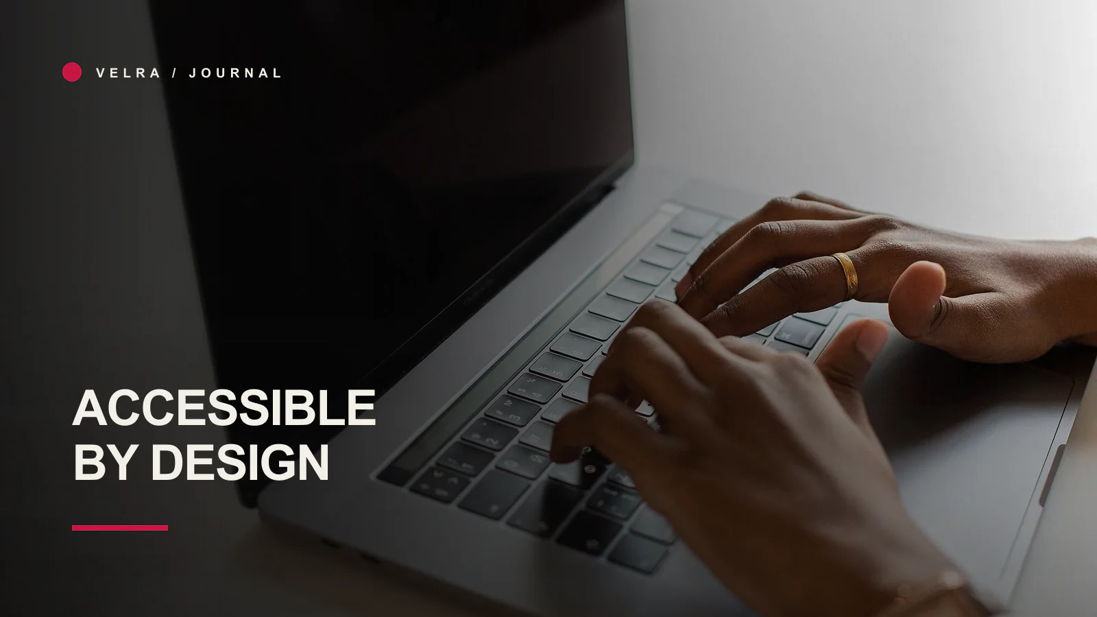
Accessibility is frequently reduced to one of two unhelpful things: a compliance badge or an automated score. Neither tells you whether a person can actually use the website.
A site can score well and still trap keyboard users in a menu. It can include alternative text that says “image123”. It can meet a contrast ratio while presenting error messages nobody can find. Accessibility lives across content, design, code and ongoing publishing.
This article is practical design guidance, not legal advice. UK organisations should obtain appropriate advice for their duties and sector. The Equality Act 2010 is the relevant legal context for many service providers; WCAG provides a technical standard, not a complete legal determination.
Use WCAG 2.2 as a reference, not a scavenger hunt
The W3C’s Web Content Accessibility Guidelines 2.2 organise success criteria under four principles: perceivable, operable, understandable and robust. WCAG 2.2 added criteria including focus appearance, target size and alternatives to some dragging movements; the W3C summarises those changes in What’s New in WCAG 2.2.
For most business websites, aim to understand the experience rather than tick criteria in isolation. Begin with important journeys: learn about a service, inspect proof, submit an enquiry, manage consent and recover from an error.
Can the site be used with a keyboard?
Put the mouse aside and start at the address bar. Press Tab through the page.
Check that:
- every interactive control can be reached;
- the focus indicator is easy to see;
- focus order follows the visual and reading order;
- menus, accordions and dialogs work with expected keys;
- Escape closes temporary overlays where appropriate;
- focus returns to the trigger after a dialog closes;
- no component traps focus accidentally;
- a skip link allows repeated navigation to be bypassed.
Custom cursors and hover effects must never replace the real focus state. If a card reveals its only action on hover, touch and keyboard users may never discover it.
Are headings and landmarks meaningful?
People using screen readers often navigate by headings and regions. Use one descriptive primary heading, then create a logical hierarchy. Do not choose heading levels because of their default font size.
Label navigation areas where more than one exists. Use main, header, footer, article and aside according to their purpose. A page made entirely from anonymous div elements may look correct while exposing little structure.
Is contrast doing enough work?
Check text and meaningful interface elements against their backgrounds. Small pale-grey copy on cream may fit an aesthetic but fail the reader. Do not communicate errors, status or selected state with colour alone.
Contrast tools are useful, but inspect real pages too. Thin type, image overlays, transparency and bright outdoor screens can make technically passing text difficult.
Treat utility text as information, not decoration. If a label matters, it must be readable.
Do images have the right alternative text?
Alternative text should communicate the purpose of the image in context.
- A decorative texture can use empty alt text.
- A project screenshot may need to identify the interface and what the article is discussing.
- A logo used as a link needs an accessible name for the destination.
- Text embedded in an image should usually be available as real text too.
Do not begin every description with “image of”. Do not stuff search terms into it. If an image contains complex information, explain that information nearby rather than forcing an essay into the alt attribute.
Are forms clear before and after submission?
Forms are where accessibility failures become commercial failures.
Check that every field has a persistent label, optional fields are marked, instructions appear before they are needed and browser autocomplete is supported. On error, show a summary and inline messages, move focus appropriately and preserve what the person entered.
Pending states should prevent duplicate submissions without making the interface silent. Success should explain what happens next. Placeholder text is not a label.
Our broader guide to why good-looking websites still produce too few enquiries explains how accessible form behaviour also protects the commercial journey.
Can people control motion and media?
Respect the user’s reduced-motion preference. Stop marquees, typing effects and non-essential reveal animation when it is enabled. Content should be present before animation rather than hidden until a scroll event succeeds.
Do not autoplay video with sound. Provide controls when somebody needs to pause or replay. Captions or transcripts may be required depending on the media and information conveyed.
Motion should explain or respond, not force everyone to watch the brand perform.
Does the site survive zoom and small screens?
Test at 200% browser zoom and at widths around 320 and 390 pixels. Look for horizontal scrolling, clipped dialogs, controls hidden behind fixed elements and tables that become unreadable.
Touch targets need sufficient size and separation. WCAG 2.2 includes a target-size criterion, but the practical test is whether somebody can select the intended control without precision.
Responsive design is not only fitting columns on a phone. It is preserving hierarchy and operation when space changes.
Is the language understandable?
Accessibility includes comprehension. Explain specialist terms, use direct labels and make link text meaningful outside its sentence. “Read our web design process” is more useful than “click here”.
Keep sentences purposeful. Legal and technical accuracy may require complexity, but complexity should come from the subject rather than inflated language.
Test errors and missing content
Many reviews inspect only the perfect state. Deliberately break things:
- submit an empty form;
- upload the wrong file type;
- remove an image;
- expire a session;
- load a missing article;
- reject analytics consent;
- navigate with a slow connection.
The fallback, validation and recovery states are part of the product. They need accessible names, focus behaviour and enough context to continue.
Automated tools are the beginning
Automated tests can find missing labels, some contrast failures and invalid relationships. They cannot decide whether the heading is useful, alternative text is accurate or a workflow makes sense.
Combine:
- automated checks on representative pages;
- keyboard-only review;
- screen-reader checks on critical journeys;
- zoom and responsive testing;
- testing with disabled people where the context and budget allow;
- regression checks after content and component changes.
An accessibility overlay is not a substitute for fixing the underlying interface.
Make accessibility an operating practice
Assign ownership. Add accessibility criteria to design reviews, development acceptance and content publishing. Record known limitations and prioritise fixes by impact.
We do not describe a Velra project as “accessible” or certified without a defined audit and evidence. We can say that accessibility informs our web design and development process, and we can show the specific practices used. Precision is more trustworthy than a broad badge.
If you are planning ongoing checks, add accessibility regression to your website care routine. If forms or navigation are already difficult to operate, that is a reason to act now rather than wait for the next redesign.