
Behind the Work
Designing for Trust: What Healthcare, Legal and Engineering Websites Have Taught Us
Trust is not one visual style. Healthcare, legal and engineering audiences look for different evidence, language and paths before they are ready to act.
Velra Studio · · 6 min read
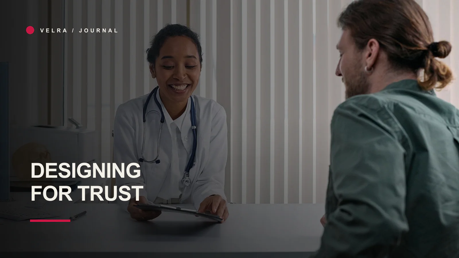
“Make it feel trustworthy” is one of the most common requests in a website brief. It is also one of the least useful until we ask: trustworthy to whom, for what decision and based on which evidence?
Healthcare, legal and engineering organisations may all need authority, but a single visual formula cannot express it honestly. Dark blue, a serif typeface and photographs of handshakes do not create trust. They create category familiarity.
Across our work for Chellaston Hearing Services, Akande & Akande Chambers and Extrude Solutions, we found that trust had to be built through different balances of reassurance, professional clarity and technical competence.
These are qualitative project observations. We are not claiming measured conversion improvements or formal accessibility certification for the sites.
Trust begins before visual style
People assess whether an organisation appears to understand their situation. That assessment is shaped by the order and precision of information.
A healthcare visitor may need to know who will see them, whether the experience feels personal and what happens at an appointment. A legal client may need to establish scope, professional authority and confidentiality. An engineering buyer may need to understand capability, terminology and whether the supplier can operate in a demanding technical context.
The page should answer the risk attached to the decision.
Healthcare: reduce uncertainty without removing expertise
For Chellaston Hearing Services, the website had to communicate professional hearing care while remaining personal and approachable. A clinical service can become intimidating if the interface feels distant or overloaded with terminology. It can also become unconvincing if warmth replaces substance.
We focused on a clearer patient journey: what the service is, who it is for, the practitioner behind it and how to take the next step. The visual system could feel gentle without becoming vague.
What we would carry into another healthcare project
- Put practitioner identity and qualifications where they help the decision.
- Explain the appointment or treatment journey in plain language.
- Make contact and booking routes obvious without pressure.
- Avoid generic medical imagery when real, approved context is available.
- Treat privacy, form handling and accessibility as core product decisions.
- Distinguish reassurance from unsupported promises.
In healthcare, a calm design helps only when the information underneath it is complete.
Legal: authority without inherited theatre
Legal identities often reach for the same symbols and language: columns, scales, shields, tradition and absolute confidence. Those conventions can signal category, but they can also make every practice look interchangeable.
For Akande & Akande Chambers, the work needed a professional identity and digital presence with enough authority for the sector and enough character to be remembered. The website had to organise the practice and its services rather than rely on a prestigious-looking mark to do all the communication.
What we would carry into another legal project
- State jurisdictions, services and professional context accurately.
- Make the people and route to instruction understandable.
- Use confident language without guaranteeing outcomes.
- Provide proper legal and privacy information.
- Avoid decorative traditions that do not belong to the practice.
- Build the identity across documents and digital use, not only the logo.
Legal trust is precise. A small inconsistency in a name, credential or service description can undermine a large amount of visual polish.
Engineering: make complexity navigable, not simplistic
Technical businesses often face the opposite pressure. They hold deep knowledge, but the website assumes visitors already understand the internal terminology. The result can be technically accurate and commercially opaque.
For Extrude Solutions, the design needed to present engineering capability with authority while making the offer easier to navigate. Simplification did not mean removing important detail. It meant establishing an order: orient the visitor, explain the capability and then provide the depth needed for evaluation.
What we would carry into another engineering project
- Use the language customers and technical evaluators actually use.
- Separate high-level orientation from detailed capability.
- Show real processes, applications or work where approval allows.
- Explain the company’s role in the wider operational context.
- Make contact routes suitable for a considered B2B enquiry.
- Avoid futuristic visual clichés that make every technical firm resemble a software start-up.
Engineering trust is often built through specificity. Removing all technical language in the name of simplicity can be as damaging as leaving it unstructured.
What the three projects share
Despite the differences, several principles travel well.
Visible responsibility
Trust improves when people can identify who is behind the service, the work or the organisation. That does not require turning every studio into a personality brand. It requires enough real identity that the business does not feel anonymous.
Clear next steps
A visitor should know what will happen after an enquiry. The action can be calm and still be clear.
Appropriate proof
Use the proof the audience needs. Qualifications may matter in healthcare, professional status in legal work and technical applications in engineering. One generic testimonial carousel cannot carry every trust problem.
Consistency
Names, claims, addresses, services and contact details should agree across the site and important external profiles. Contradiction creates doubt quickly.
Restraint
Do not claim certification, performance or customer outcomes that have not been documented. Trust design includes knowing what not to say.
Where visual design genuinely contributes
Visual design establishes emphasis and emotional temperature. Typography can feel institutional, personal or technical. Colour can aid orientation and recognition. Spacing can reduce cognitive load. Photography can replace abstraction with real context.
But these choices work through the content. A beautiful card cannot make a weak case study credible. A soft palette cannot make a form feel safe if it asks for unexplained personal information.
That is why we prefer to design the argument and interface together.
A trust audit for your own website
Choose one high-value service and ask:
- What does the visitor risk by choosing badly?
- Which question would they ask a person before proceeding?
- Is that answer visible on the page?
- Which proof is relevant, current and approved?
- Are important claims specific enough to verify?
- Does the interface support keyboard, mobile and error recovery?
- Is the next step proportionate to the decision?
- Does the follow-up match the expectation the page creates?
Then ask somebody outside the business to use the page. Internal teams often fill gaps from memory that a new visitor cannot.
Trust is sector-specific, but not cosmetic
The lesson from these projects is not that healthcare should be soft, legal should be formal and engineering should be dark. Those are superficial shortcuts.
The lesson is that trust follows the shape of the customer’s uncertainty. Design should reveal the people, evidence, process and language that reduce that uncertainty honestly.
Our selected work shows how those decisions produce different visual outcomes. If your current site looks credible but does not explain why the business deserves confidence, our web design and development approach starts by identifying that missing argument.